| 10210 Systems Parkway, Suite 390 Sacramento, CA 95827 |
|
| cd1@catalinadirect.com | |
| 1-800-959-SAIL (7245) |
Color Palettes
CSS (Cascading Style Sheets) control the entire website. All font and background colors are controlled through the foundation.min.css, css/style.css, and css/custom.css files.
- Foundation is a css framework and loaded from a CDN. There's a copy of it css/foundation.css. Changing this file does not effect the website.
- Style.css holds all the styling for CFWebstore. Try not to make changes to this file.
- Custom.css is a blank file that allows you modify your store. Try to add all your changes here.
NOTE: We've added a bunch of common changes to custom.css. They're commented out so they don't effect your site unless you un-comment them.
I don't do CSS, what now?
Palettes are used to define the colors used for your design in the store. You can set up as many different palettes as you want to and use them for various pages throughout the store. A palette willl override the css in foundation.min.css and style.css. Custom.css will override the palette.
If you created a new palette to use for your store default, be sure to also update your Main Settings to use it.
The Palettes list includes a link to Copy an existing palette, so you can duplicate all the current colors and make a few changes to create a new layout.
Color Picker
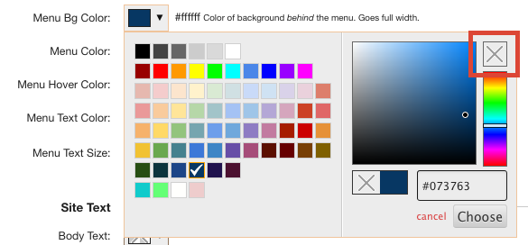
When you click the color picker you get a pop-up with three things:
- Color Palette - these are default colors that will look good on the store (think buttons).
- HEX - you can specify the hexidecimal color
- No Color - the little box with an X means no color is specified. This is the default color choice for new stores.
LAYOUT
- Palette Name: Name used to refer to this palette in the admin area.
- Layout File: Custom layout, if any, to use with this palette. See the custom layout section below for more information.
- Parameters: For more advanced CFWebstore developers, this allows you to send custom parameters to a layout page, to do things like swap header images, etc. This allows you to easily use a single cfm template for multiple store palettes.
- Width: This choice allows for boxed or full width. Boxed is a centered area with sides that a background can be applied. Full width has the page stretch across the full browser width with no background.
- Background Color: Background color for the page.
- Background Image - Upload a background image. The background image overrides the background color.
TOPBAR

- Display: Show or hide topbar.
- Topbar Background Color: Set the background color (allways shows full width).
- Topbar Text Color: Color of the text and links.
- Topbar Features: Choose which features you want to show in the topbar.
- Social Media - Go to Site Design > Social Media to turn on/off the icons you want to use.
- Text Banner - Message will appear at the top of the website.
- Page Menu - Go to Site Design > Pages and add a page called 'Header Navigation' and make it a header menu. Any links added under Header Navigation will appear in the topbar.
- Text Banner: You only need text in the first box. If you add text in the 2nd and 3rd fields then the messages will rotate.
HEADER
- Header Style: Left or centered logo.
- Header Icon Style: Show expanded buttons (search and cart), buttons only, or icons only.
- Header Mobile Style: Logo left or centered. Logo centered only shows menu and cart buttons.
- Show Navigation Icon: Choose to show the hamburger menu (three lines) on mobile.
- Show Cart Icon: Choose the icon shown for the shopping cart. On desktop, shows a dropdown window with cart contents.
- Show Search Icon: Show or hide search box.
- Show Phone Icon: On mobile, links directly to the phone number in Main Settings. On desktop it links to Contact Us.
- Show Email Icon: On mobile, links directly to the email in Main Settings. On desktop it links to Contact Us.
- Show Marker Icon: On desktop, will show a dropdown with a Google Map, address, email. Settings come from Main Settings. On mobile simple links to Contact Us.
- Icon Color / Button Background Color: This is the color of icon or the color of the button background depending on which style you're using.
MAIN MENU
- Main Menu Style: Choose
- Default dropdowns (Foundation)
- Single row only - this is a responsive menu that gets smaller as your screen gets smaller. The extra links get hidden.
- Mega Menus - (requires extra license)
- Left column only - there are three styles available: simple, accordian, and flyout. The dropdown can be found in Admin > Main Settings under Default Side Menu Style. This setting is also used for category menu style.
- Align: Forces the menu to align left, center, or right. Expanded forces the links to fill the available space. Only applies to default dropdowns.
- Home Page Link: Choose the style of home page link - mixed, upper, or icon.
- Top Row Uppercase: Force the top row to all capitals.
- Menu Levels: If you categories 3-4 levels deep but only want to show the top categories and one sub-category, you can set that here.
- Menu Bg Color - Sets the background color behind the menu. This stretches the width of the site.
- Menu Color: This is only the background behind the menu, does not go full width.
- Menu Hover Color - Set the color of the rollover for the menu.
- Menu Text Color - Set color of text within menu.
- Menu Text Hover Color: Set the color of text on rollover.
- Menu Text Size - Set the size of the text with the menu. Must be larger than 11 to apply.
SITE TEXT
- Body Test Color: Choose your text color.
- Body Text Font: Enter a font name. You can choose from Web Safe fonts or Google Fonts.
- Headers: Choose your text color.
- Header Font: Enter a font name. You can choose from Web Safe fonts or Google Fonts.
- Links: Choose color for all text links.
- Visited Links: Choose the color for all visited links.
- Link Hover: Choose the hover color when you rollover a link.
- Button Color: Choose the color for buttons.
- Button Hover Color: Choose the color for button rollovers. Not all buttons have use a rollover color.
FOOTER
The footer and sub-footer consist of a box within a box. The background color stretches full width of the website (only noticeable if using fullwidth layout).
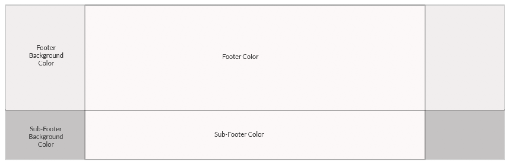
- Footer Background Color: Choose the background color for the footer area.
- Footer Color: Choose the color.
- Footer Text Color: Choose the text color.
- Footer Text Hover Color: Choose the text rollover color.
SUB FOOTER
- Sub-Footer Background Color: Choose the background color for the footer area.
- Sub-Footer Color: Choose the color.
- Sub-Footer Text Color: Choose the text color.
- Sub-Footer Text Hover Color: Choose the text rollover color..